
DEEP DIVE
UX Design
Built for data. Not for the people reading it.
The KLAS market segment pages were functional the way a spreadsheet is functional. Everything was there. Nothing was designed to be found. Rebuilding the information hierarchy so healthcare professionals could find what they came for without having to work for it.
Company
KLAS Research
Year
2016 to 2018
Discipline
UX design, information architecture
The problem
Built for data. Not for readability.
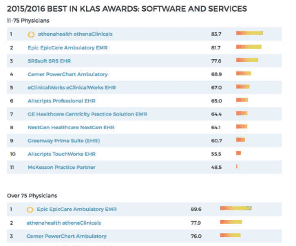
When I joined KLAS in 2016 the market segment pages were functional the way a spreadsheet is functional. Everything was technically there. The data was split across three to five tabs, with the most important vendor rankings buried below the fold and key links invisible until you scrolled. The temperature indicator bars that communicated product scores were all the same color regardless of the actual score, which meant a ranking of 83.7 looked identical to a ranking of 48.5 at a glance. Color is the fastest signal the human eye reads. It was not being used.
A healthcare executive or vendor doing competitive research does not have time to discover that the information they need is on tab three. They leave. The page was organized for the database, not for the person trying to make a decision.

What I saw
The developer solved the wrong problem
The data structure was logical. The tabs made sense from a back-end organization standpoint. What the developers who built the page could not see was the context in which a real person used it. A hospital IT director evaluating EMR vendors is not browsing. They are looking for a specific thing under real time pressure. Every tab, every scroll, every buried link was friction standing between them and the answer they came to find.
The segment expert, a named KLAS research director with domain knowledge of that specific market, was buried in the left column like a design afterthought. That person was actually one of the most valuable things on the page. Trust in KLAS research comes from knowing a real human expert with deep domain knowledge stands behind the data. Making that person hard to find was undermining the product's core value proposition.
Before and after
Before — 2016 developer-built layout
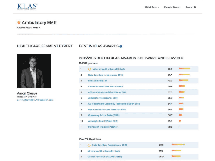
Data split across three to five tabs. Monochrome score bars that communicated rank through length alone, not color. The segment expert buried in the left column. Most important links below the fold. Organized for the database, not the user.
After — 2018 redesign
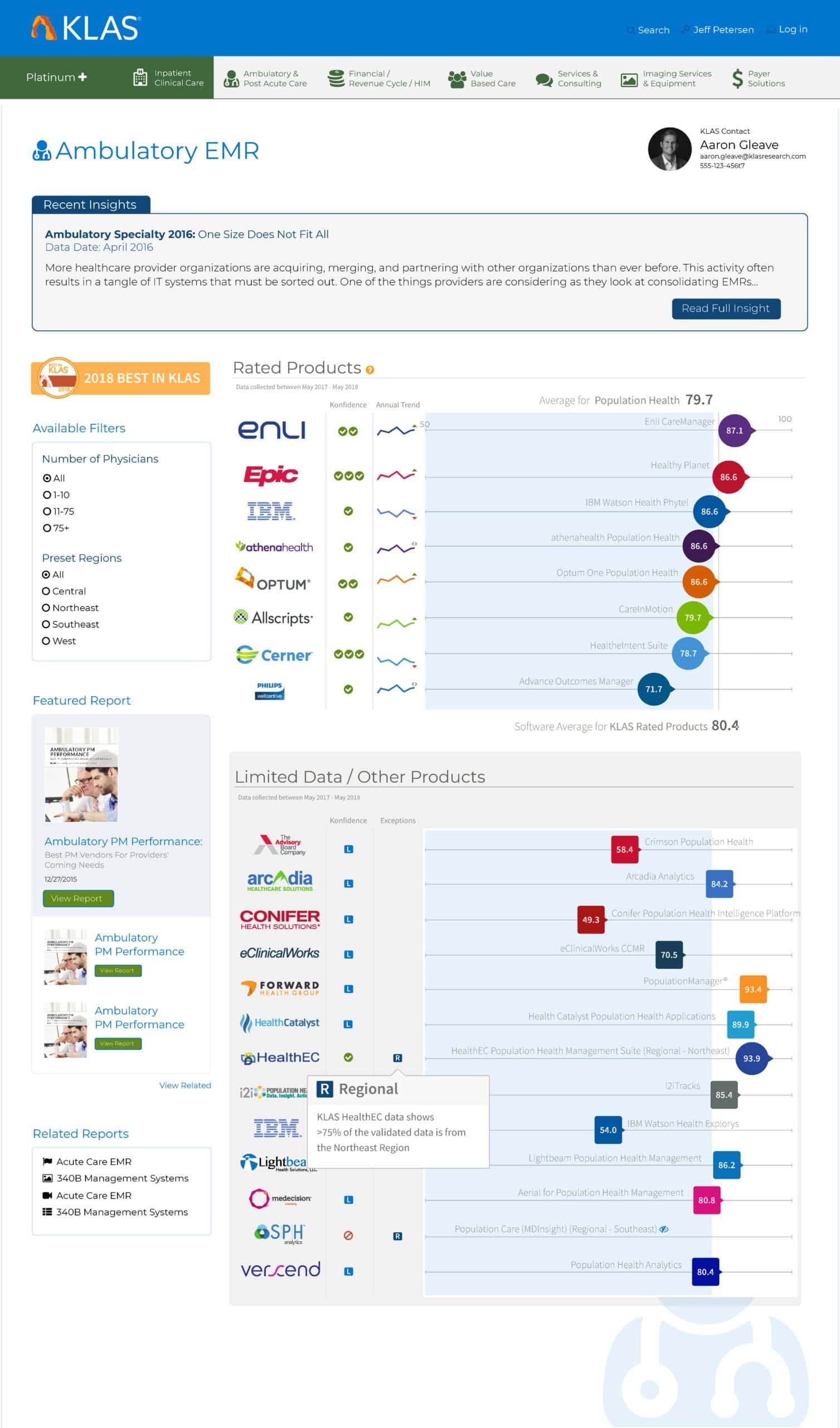
Everything on one page. Colored score circles positioned on a horizontal axis so competitive performance is readable at a glance. Filters persistent in the left column. Segment expert prominent in the upper right, dynamically matched to the market segment. Best in KLAS award mark visible above the fold.
The decisions
The outcome
Everything the KLAS team needed,
above the fold
The internal response from the KLAS team was immediate and positive. The new design consolidated information that had been scattered across multiple tabs into a single coherent page. The most important data was above the fold. The right expert was visible without scrolling. Vendors and healthcare providers could now read the competitive landscape in their segment at a glance rather than assembling it from fragments across multiple views.
The dynamic segment expert routing meant the redesign worked as a system, not just as a single page template. As KLAS grew its segment coverage the right expert automatically surfaced for every new segment added without any additional design intervention.
What I learned
Data and information
are not the same thing
A page can contain every relevant data point and still fail its user completely. Data becomes information only when it is organized and presented in a way that matches how a person actually thinks and decides. The temperature indicator bars in the original design contained accurate scores. They communicated nothing useful at a glance because the designer who built them was thinking about the data, not the decision the user was trying to make.The other lesson is one I carry into every data-heavy design problem now. The most important element on a page is often the one that feels softest. The segment expert contact information felt like a nice-to-have detail. It was actually the trust anchor the entire page depended on. Getting that wrong meant the data, however accurate, arrived without the human credibility that made it worth acting on.
Next deep dive