
DEEP DIVE
Brand Standards
One winner per segment. Out of 800.
Designing the Best in KLAS award system across 180 market segments, the credential healthcare vendors fight to put on their homepage.
Company
KLAS Research
Year
2016 to 2023
Discipline
Award system design, brand standards
The problem
A prestigious award in
an unworthy package
When I arrived at KLAS in 2016, the Best in KLAS award mark looked like something assembled in Microsoft Word. A gold laurel wreath, a white circle, a serif font, and a year. Generic prestige cliches stacked on top of each other, communicating nothing specific about KLAS, about healthcare IT, or about why winning this award meant something.
The irony was that the award itself was genuinely significant. Over 800 healthcare software and services solutions competed across more than 180 market segments. One company won per segment. Vendors fought aggressively to earn it. And then they were handed a badge they were mildly embarrassed to put on their homepage.
I knew the mark needed to change when vendors started asking for it directly. The people receiving the award were telling us it was not good enough to wear with pride. That is about as clear a design brief as you ever get.
Before and after
The original mark. Gold laurel wreath, white circle, dated serif typography. Generic prestige cliches that communicated nothing specific about KLAS or the rigor of the research behind the award.



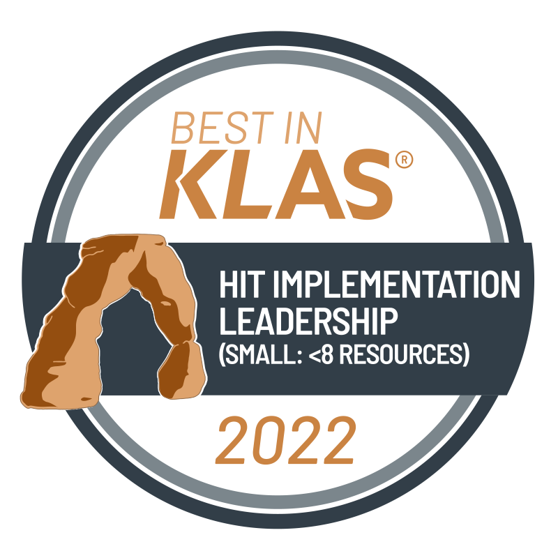
The evolved mark. The KLAS arch icon at the top, updated color and typography, a visual system that reflects the authority of the brand behind it. A credential vendors wanted to display.

Each iteration gained ground on the original without abandoning the recognition the mark had already built. Equity maintained, mediocrity removed.
The constraint
Design for the
worst case first
Other shapes were explored. The round form was questioned. But tradition and customer expectations brought every exploration back to the circle. Seven years of award winners had built recognition around that shape, and walking away from it would have meant walking away from the equity the program had already earned.
The real complexity was in the system requirements. Every mark had to accommodate our longest segment title without breaking. Every mark had to scale from a thumbnail on a vendor homepage to a banner at a healthcare industry conference without losing legibility. Every mark had to work in full color for digital, in single color for print, and at the minimum reproduction sizes those applications demanded. The KLAS arch icon at the top of each award had to hold its form across every size and format.
I designed from the worst case outward. The longest segment title set the typographic floor. The smallest reproduction size set the detail ceiling. Everything between those two constraints had room to breathe, and every future segment the program added could be accommodated without starting over.

The decision
Grow the mark
with the brand
As the KLAS visual identity matured, the award mark had to mature with it. The two systems needed to feel like they came from the same organization. Color, typography, and proportion all evolved to reflect the growing authority of the KLAS brand while maintaining the credibility the award had built in the market.
The system also expanded. Best in KLAS and Category Leader required distinct treatments that read as related but separate credentials. Every variant had to work at thumbnail size on a vendor homepage, at large scale on a tradeshow banner, and in single color for print applications KLAS had no control over.
The outcome
A mark vendors built
their marketing around
Over seven years the award system evolved through multiple iterations, each one gaining ground on the original without abandoning what made it recognizable. The mark became something healthcare companies featured prominently on their websites, in their sales materials, and at industry events.
The most telling behavior came later. Companies began displaying consecutive annual wins side by side, building timelines of repeated recognition that stretched across their homepages. Nobody lines up badges they are embarrassed by. Nobody constructs a five-year row of credentials that feel generic. The fact that vendors built marketing strategies around consecutive wins is the clearest evidence that the mark became something worth earning and worth showing.
When I left KLAS in 2023 the mark had grown from a generic clip art credential into a visual system that reflected the authority of the research behind it, scaled reliably across 180 market segments, and traveled into vendor marketing materials without any help from KLAS at all.
What I learned
Equity is invisible until you threaten it
The hardest part of this project was not the design. It was understanding why the constraints existed. Every time an exploration pushed too far from the familiar form, the pushback was not aesthetic. It was about trust. Healthcare executives had learned to recognize this mark. Changing the shape would have meant asking them to learn it again, and in a market built on trust and authority, that is a risk nobody wanted to take.
The lesson I carry into every brand evolution project now is this. Before you change anything, understand what recognition you would be destroying. Sometimes the thing that looks most wrong is the thing you can least afford to change.